How To Make Your Copy look good, like really good ?
Building content goes beyond than words. You need to design something great. Something that people will actually read and engage with. Of course, that might be a bit challenging.
Most people around us have goldfish attention spans. They skim through rather than read the words that you put up online. That means you shouldn’t expect them to understand everything either. But if you manage to use the following principles the future will be brighter for you.
Principle #1: What’s a good typeface?

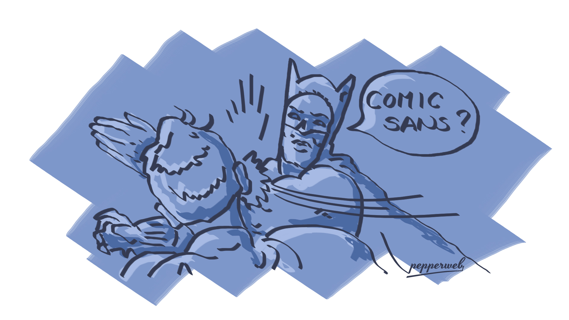
Don’t be selfish. Even though you might love to work with a more intricate typeface, that doesn’t mean it works. Simpler, sans-type fonts tend to work best. What matters is for the typeface to be readable, otherwise it won’t get read. Design for the user and not yourself. To do this effectively you need to use typefaces that are easy on the eyes. In other words easier to scan. Don’t create weird shapes. The most common characteristics of a readable typeface are:
-Medium thickness
-Highly readable
-Simple/ Round
Just by looking at the above we can easily see that virtually everything points to simplicity. You don’t necessarily have to stick to serifs or sans serifs; a mix might often be good. Just make sure to test it out and make sure they’re readable.
Principle #2: Use Size & Scale To Set Your Priorities

You are the master of your fate. You have all the power to guide users in the right direction. You just need to do it in the right way. What always does the trick is establishing hierarchy. You can do this by using readable design. But what does that even mean?
Help the users mentally break down the text in sections. For this you need to employ something called levelling. Use larger and smaller fonts to send importance signals. In other words, tell the users what’s important or necessary to scan by offering visual cues. If you really want to establish a decent visual flow you need to put your H2, H3 and H4 tags to good use.
Let’s be honest here, large blocks of texts are boring. Create prioritized chunks of text but be consistent. If not, the end result will be chaotic and unpleasant. Meaning your conversions or whatever objectives you have set for those content pieces will go down the drain. The majority of your users will read the text in this sequence: Headline, bolded bits and pieces, subheading, body, and then all the rest.
Principle #3: Get Visuals On Your Side

Do you really want to make certain that users will notice you? Integrate visuals with other elements and skyrocket the immersiveness of your design. Text and visuals must be paired in a way that makes sense. Your goal is to make them pause and think. Ideally, you need them to take action as well.
Most people get it wrong. They tend to separate every single element in its own confined space. The two need to coexist in unison. If you learn this skill, it’s almost guaranteed that you will draw users into your marketing message. If you master it, they’ll be coming back for more.
Principle #4: Stack It Up

This loops back to hierarchy. But the difference is that it refers to more than just text. Our attention span is conditioned to first scan the text and then focus on the image in the background. Our goal here is to help users move through from image to text in a natural way.
Principle #5: Mind The Center
Every design must have a center point. It must be establishing what the design is about and give your visitors a reason to care. This focal element must be integrated to the background. Sometimes you can even use contrast to your advantage. The end result must be highly visual and speak to the senses.
It only makes sense for this to be your best image or illustration. It also needs to communicate your main message. Your users are unforgiving. They will only give you one chance. SO make sure you put it to good use.
Principle #6: Keep It Short & Sweet

Designers and writers must be like AK47s. We must shoot in short bursts. Utilize each and every page or screen to your advantage by featuring a single, simple message. We need to encourage users to keep going. Otherwise our efforts will go to waste.
To do this effectively, you need to use subheadings and bullet points. One-four sentence paragraphs work best. Bold key points make it even better. Being brief can do wonders!
Final Words
Readable content has to do with way more than just words on a screen. It’s a combination of visual elements and writing that captivates the user from the get go. Eight seconds is all the time you’ve got and you better make it count. Help them understand what the design is about and they will return the favor.

Inline edit
